Pantone’s 2022 Color of the Year is Very Peri – a bright and playful blue/purple hue. I honestly couldn’t be happier about this! Periwinkle is a color that is not over used in most things we see, including branding. Let’s look at what makes it such a great color in general and a good choice for branding.
It's a Bright & Happy Color
Happy is a really broad term, so let me clarify; periwinkle brings up feelings of playfulness, giddiness, curiosity and creativity. It reflects that feeling of stability that blue holds and also the joy that purple brings. In the marketing and business world, periwinkle can be used as a powerful tool to bring the right feelings into visual elements.
It’s Versatile & Approachable
It’s a bright color that manages to be vivid without being offensive. It’s not a color that’s associated with any one thing in particular, and we don’t really see a lot of it in our daily lives. Those qualities make it a great choice for use in branding and product brand guidelines. Periwinkle works with so many other colors, which makes it a great addition to existing branding or a strong base for a new brand. I’m excited and hopeful to see it make its way into more online and offline marketing, branding and design! The one setback I think it faces with print design is that it can be difficult to replicate, but I think it’s worth the challenge. However, the qualities that make it difficult for print design are not an issue when using it for website design or other digital applications.
It’s Inspiring
As a Brand Designer, I see so many possibilities with periwinkle. Brand colors are important to a business because they are one of the first things to communicate something about that business to the audience. Choosing colors that set the stage for a company’s messaging is something that should be done with consideration to each individual company. Here are some brand color palettes inspired by periwinkle:
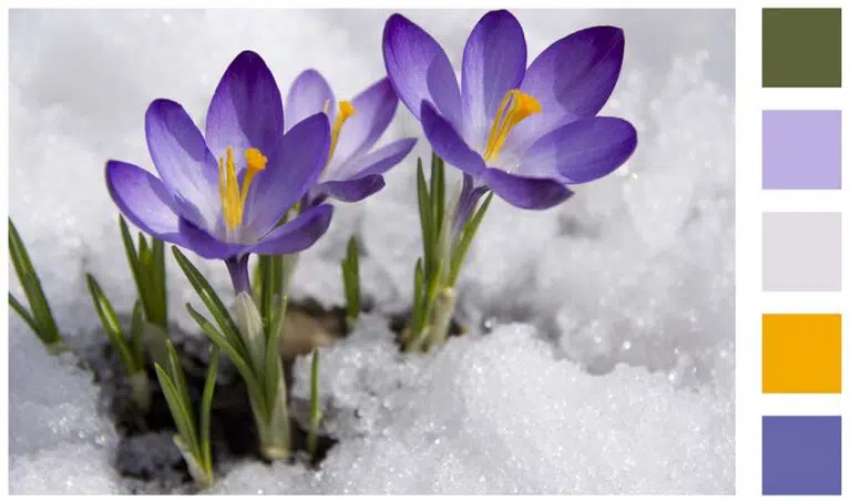
It’s soft enough to look like early spring with deep green, light lavender, not quite white and a bright golden yellow.
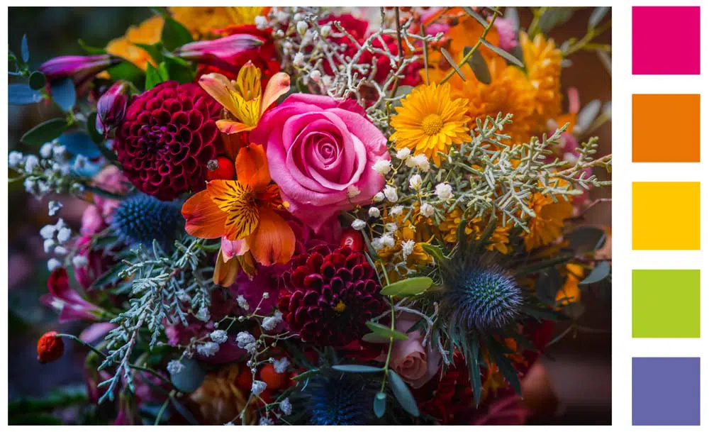
You can bring its brightness forward by combining it with bright pink, vibrant orange, sunny yellow and a light lime green.
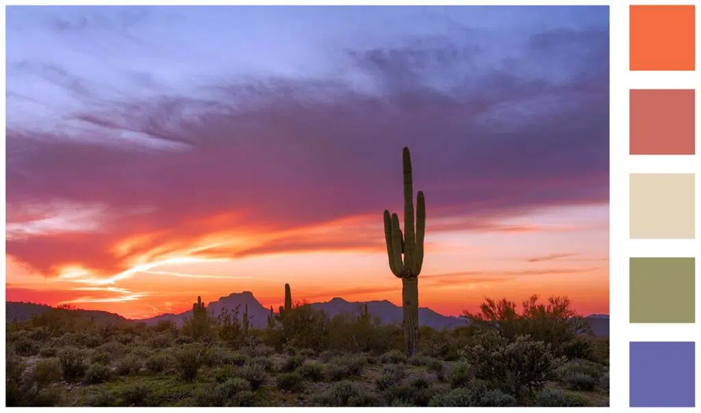
It could also be made into a palette that emulates the desert sky turning to dusk with a bright orange rust, pale clay red, sandy beige and muted cactus green.
Even if you’re not a brand designer, I hope this inspired you to bring more periwinkle into your life! If you have any questions about visual branding, messaging, or general marketing feel free to reach out to us or schedule a meeting at BanowetzMarketing.com/Contact.